Capacity Building
Understand
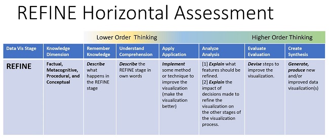
- What what happens in the refine stage.
- Describe the methods or techniques used to improve the visualization (make the visualization better).
- Understand the impact of decisions made to refine the visualization on the other stages of the visualization process..
- Identify the steps to improve the visualization.