Represent Module

Overview

The represent stage determines the basic form that a set of data will take.

Some data sets are shown as lists, others are structured like trees, and so forth

The Represent stage is a linchpin that informs the single most important decision in a visualization project and can make you rethink earlier stages.

How you choose to represent the data can influence the very first step (what data you acquire) and the third step (what particular pieces you extract).

Source: Fry, B. (2008). Chapter 1, Visualizing data (Safari Books Online). Sebastopol, Calif.: O'Reilly Media.

Task: Generate visualization(s) based on data received from previous data visualization stages.

Key Concepts

Create
  1. Create multiple views (visualizations) using the same data.
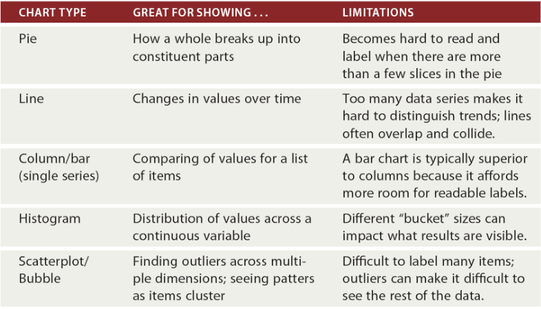
  2. Choose the appropriate chart type for the data.
  3. Use data visualization best practices.


Common Chart Types and Limitations


Understanding Charts & Visualizations: Avoid Chart Junk
  1. Should display data without distracting decoration.
  2. Unneeded details are what Edward Tufte – The godfather of modern data visualization- calls chart junk.
  3. Like shadings that reduce contrast.
  4. Or 3D views that make it hard to see where a bar starts and ends.
  5. And gradients and colors that are purely decorative.


Resources

Use the following external links for additional resources.


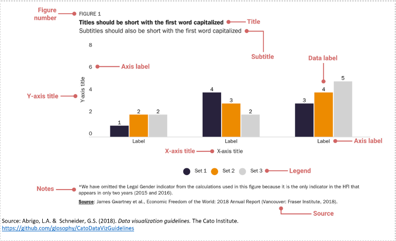
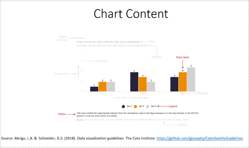
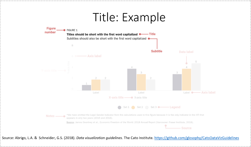
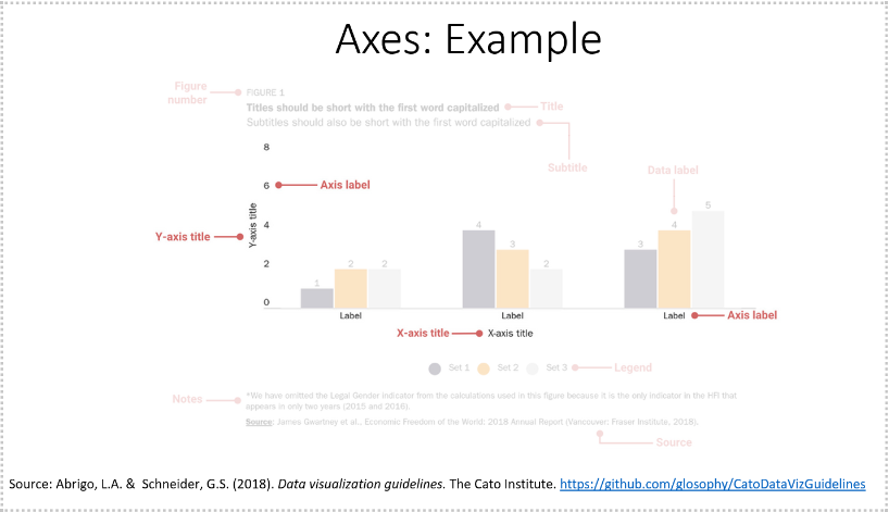
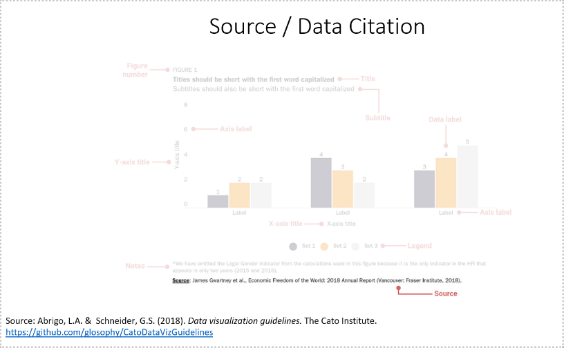
Anatomy of a Chart [Slideshow]

1 / 5
2 / 5
3 / 5
4 / 5
5 / 5


Using Color


Color Resources
You can get a custom color from an image: Use an image color picker to find out the hex code or RGB code.

Copy pre-tested color gradients:

    1. ColorBrewer 2.0
    2. CartoColors

Use a single color or group of colors as inspiration to create your palette

    3. Colorpicker for data
    4. Chroma.js Color Palette Helper

Practice Quiz

Instructions
Choose an answer and hit 'Next Question'. You will receive your score and answers at the end of the quiz.
Download Quiz
Click on "Download" to save a copy of the practice quiz.

Worksheet

Practice the module by completing the worksheet and revise what you learnt.


Self Assessment

Complete this assessment to demonstrate your current knowledge of the Represent stage:

Prerequisites: Make sure to finish the following tasks before working on this assessment.


Review

Horizonal assessment of the represent stage across the data visualization process mapped to Bloom’s Taxonomy of Hierarchical Learning

What you should know:

Bloom’s Taxonomy Hierarchy You should know
Remember This step determines the basic form that a set of data will take. Some data sets are shown as lists, others are structured like trees or spreadsheets or so forth.

The Represent stage is a linchpin that informs the single most important decisionin a visualization project and can make you rethink earlier stages. How you choose to represent the data can influence the very first step (what you acquire) and the filter step (what particular pieces you extract).
Understand Different chart types, layouts and what questions to ask when deciding which chart to use.
  1. Do you want to compare values?
  2. Do you want to show the composition of something?
  3. Do you understand the distribution of your data?
  4. Are you interested in analyzing trends in your data set?
  5. Do you understand the relationship between value sets?

What visualization stages are impacted by the refine stage and how.
Apply Appropriate chart types to fit different types of data and the implications of the represent stage on the data visualization process.
Evaluate If the appropriate chart type, best practices and techniques are evident in the visual representation of the data.
Analysis If the data is sufficient to address/answer the question to be solved or if additional data is needed.
Create Plan, generate, and produce a set of visualizations.


Choosing a Chart Type

What do you want to do? Chart Type
Compare Values To create a comparison chart, use these types of graphs: Column, Mekko, Bar, Pie (with caution), Line,Scatter Plot, Bullet.
Show Composition Use this type of chart to show how individual parts make up the whole of something: Pie (with caution), Stacked bar, Mekko, Stacked column, Area, Waterfall
Show Distribution Distribution charts help you to understand outliers, the normal tendency, and the range of information in your values. Use these charts to show distribution: Scatter plot, Mekko, Line, Column, Bar.
Analyze Trends
  • If you want to know more information about how a data set performed during a specific time period, there are specific chart types that do extremely well: Line, Dual-Axis line, column.
  • When trying to establish the relationship between things, use these charts: Scatter plot, Bubble, Line Chart.
Understand Relationships between values Relationship charts are suited to showing how one variable relates to one or numerous different variables. You could use this to show how something positively effects, has no effect, or negatively effects another variable.


Resources

Charts:
Data Vis Project: Collection of data visualization charts.
Chart Chooser
Choose the right chart type for your data. [Tableau]
The Data Visualization Catalog
The Data Visualization Checklist

Colors:
How to choose colors for your Data Visualizations
Color for data visualization
Color Brewer

What you should be able to do:

Bloom’s Taxonomy Hierarchy You should be able to do
Remember Describe what happens in the represent stage
Understand Describe what stages are impacted by the represent stage and how.
Apply Demonstrate the ability to use the appropriate visualization tool/chart/layout for the task.
Evaluate Determine if the data is sufficient or if additional data is needed.
Analysis Determine if sufficient data is available to visually represent the data.
Create Plan, generate, and produce insightful visualizations.


You are here:
  • Acquire
  • Parse
  • Mine
  • Sketching & Ideation
  • Filter
  • Represent
  • Critique
  • Refine
  • Interact